My unlikely love-letter to the Office for National Statistics
The census communications really are brilliant.
Okay, I'll admit that as an opening line, it's not a corker, but hear me out.
Great communications deserve a spotlight. Not least because in any handful of post, you're more likely to find dull, dry and uninspiring waffle or pushy sales blah blah than you are to read anything that sparks curiosity or better still, action.
Generally speaking, we've always got something better to do than read our post with care, so the reality is, we don't. Not without having our attention grabbed, anyway. By default, we're overwhelmingly likely to give it just a glance before binning it or filing it in the 'can't be bothered to read it but should probably keep it' pile (before chucking it 6 months later). But these communications do matter, and we need them to be great.
We base a lot of our financial decisions on bank post and utility bills. We know when and how to vote, thanks to the election notices and instructions that fall on the doormat. We rely on good ol’ snail mail to help us show up to health appointments on time, or understand when the bin collections change, or even give us shielding advice in a pandemic.
Yet great communications like the census nudge are still not the norm.
So, when they're done right, we should share them far and wide, in the hope that brands pay attention, and more of what lands on our doormat helps us to make good choices with minimal effort.
Here are 9 reasons why the ONS have nailed it:

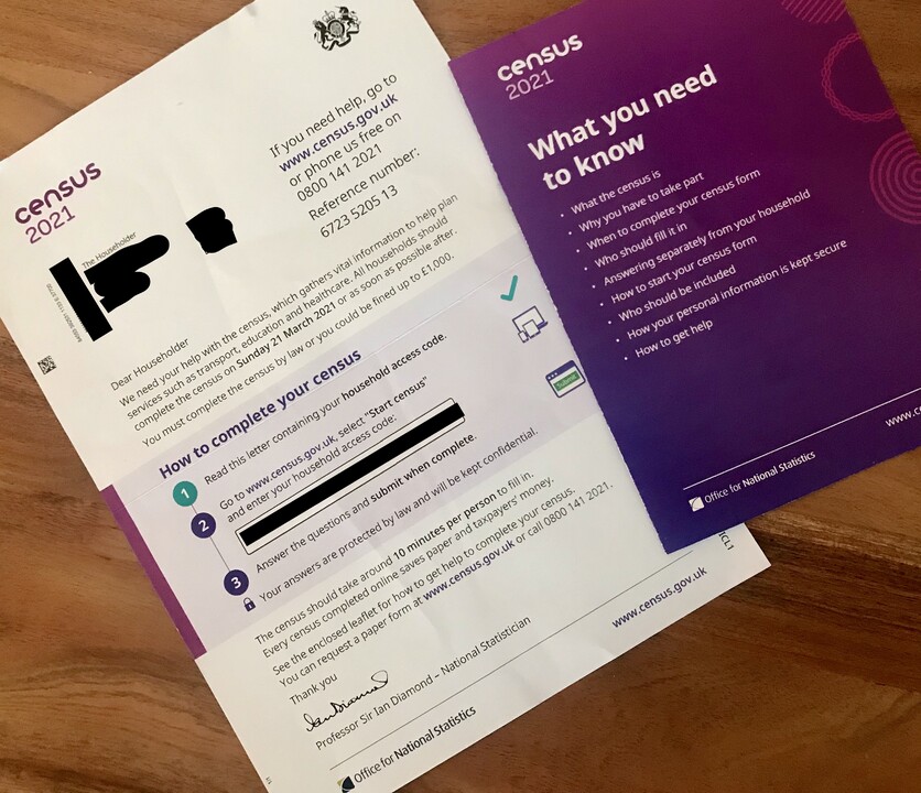
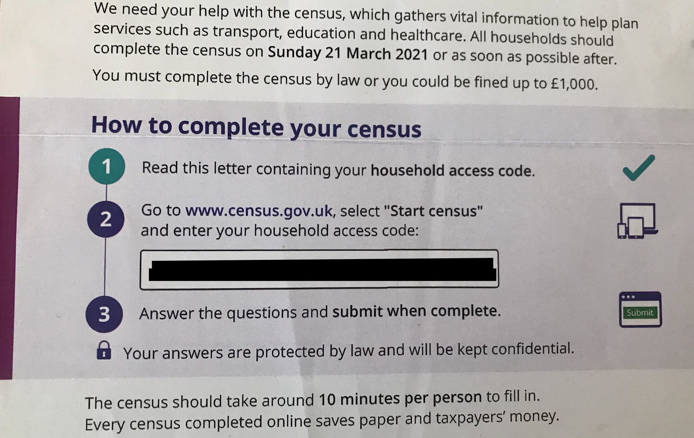
1. Your census icon tells me right away what this is about, and that it's a letter I shouldn't ignore. As we naturally read from left to right in the West, this is the first thing I see. Lovely visual priming.
2. Clear, simple instructions draw the eye at the top-right of the page. Royal Mail did some nice research a few years ago that found doing this gets messages read for 3 times as long, and it absolutely holds true in my research. Coloured boxes work equally well, but if there’s too much copy, you lose the effect, so keep it snappy.
3. In the first line, you've hooked me with your 'Greater Good' framing. By tapping into my ego and self-identity biases (we all like to think of ourselves playing our part and helping others), you've convinced me to take part with just a single sentence. The fact that you've followed up this carrot with the big stick of a £1,000 fine for not filling in a form doesn't rankle because you've led with the positive - the contribution I'll be making - instead of assuming I need to be threatened into it.
4. You've put the deadline I need to do something by early on and in bold. This is a great way to get my System 1, fast-thinking brain to sit up and pay attention.
5. Your language throughout is nice and human - accessible for everyone without trying to be my mate (cringe) or talk down to me (rage).
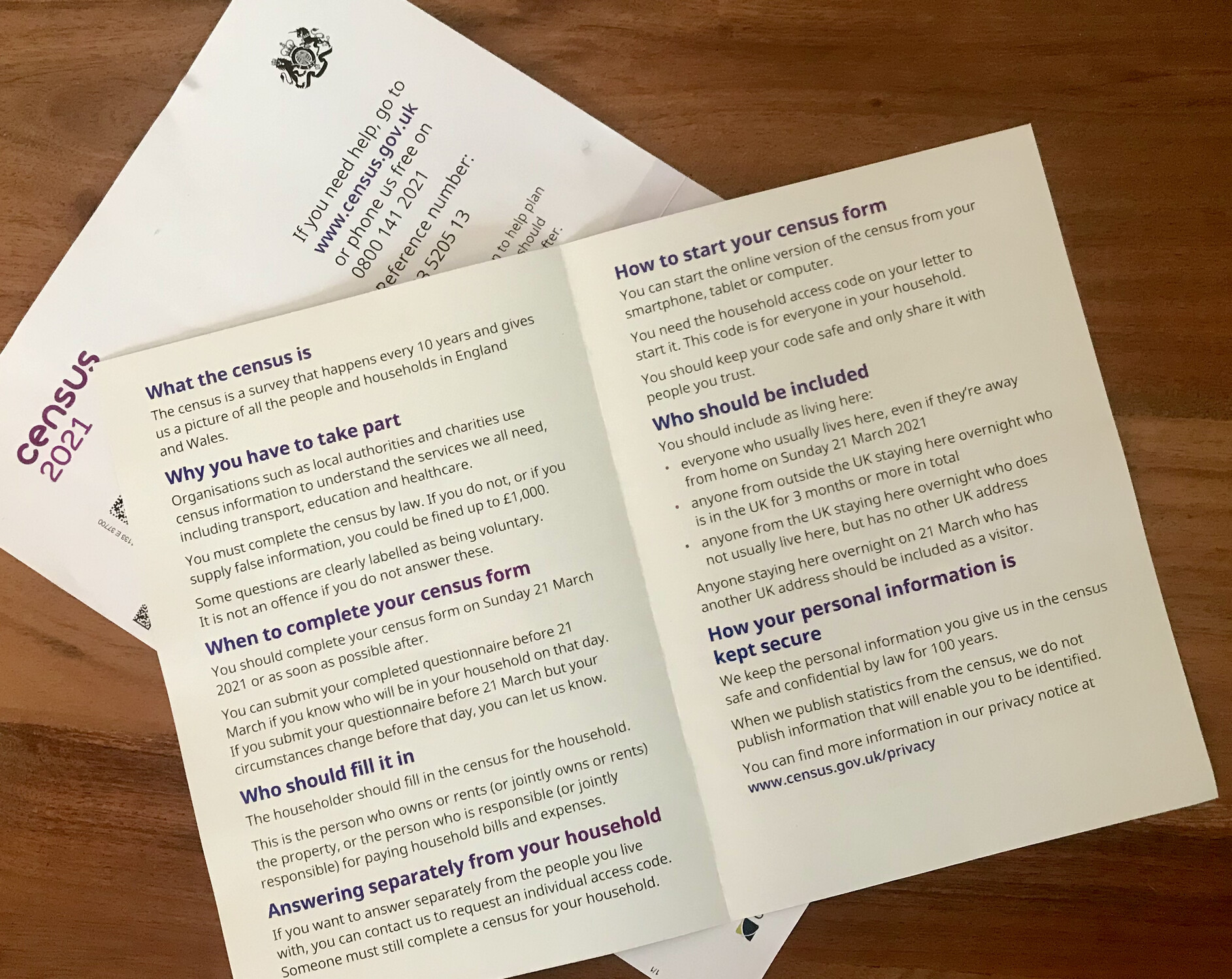
9. You've used a grateful, informal sign off with 'Thank you' that feels authentic, a signature that looks real and it’s signed by the big cheese himself, the National Statistician. I don't really know what that job title means, but it sounds important enough that it lends credibility to the whole letter. Using the right messenger will always add weight to your message.
So, applause for the team who created this first-class communication. I'd love to tag you but I don't know who you are, so please feel free to tag yourselves if you recognise your handiwork.
S.W.A.L.K.
Claire
I hope you enjoyed reading this – I’d love to hear what you think, and if you'd like to see more articles like it. Likewise, if you feel differently, I'd love to hear why. Let me know in the comments if you think my affection has been misplaced.